What can be analyzed
A dashboard should be tied to a management action, not just a nice chart.
- time windows and peak loads
- maps and geographic objects
- task and team status
- department comparisons
- automatic reports
Data becomes useful only when it can be seen, compared and used for decisions. A dashboard should answer: what is happening, where the problem is, how the situation changes and what should be checked next.
We work with analytics systems that show not just numbers, but the state of a process. This may be hospital workload, transport flows, education-program activity or internal task performance.
Good analytics starts with a correct data model: units of measurement, periods, filters, sources and interpretation rules.
A dashboard should be tied to a management action, not just a nice chart.
Users should quickly change periods, filters, objects, categories and detail levels. This makes a dashboard a working tool rather than a static presentation.
AI can help detect anomalies, forecast workload, group similar situations or explain which factors influence a metric most.
 Research Intelligent Analysis of Traffic and Congestion on Lviv Road Infrastructure
 A research project by the laboratory together with Lviv City Council for analysing traffic flows, intersection load and congestion factors on Lviv streets.
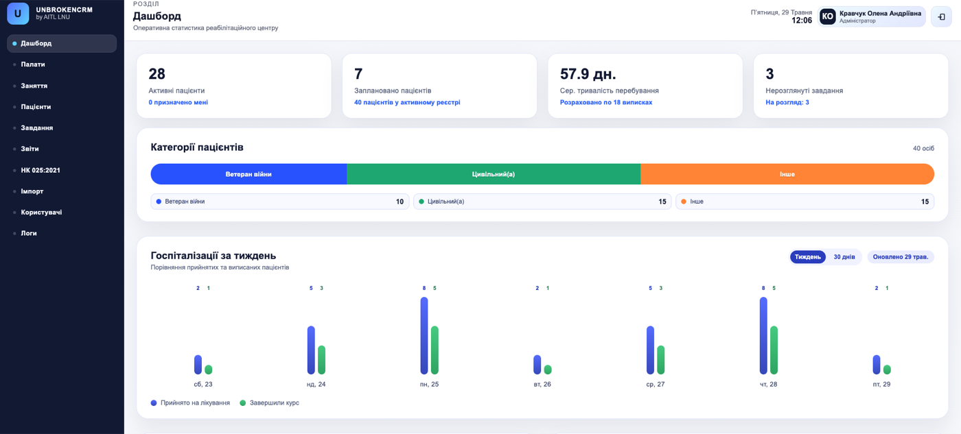 Research Research and Development of a CRM System for Unbroken Hospital
 The laboratory researched and developed a demonstrational CRM system for a medical institution: patients, staff, wards, tasks, NK 025:2021 diagnoses, PDF reports, permissions and audit logs.
A report usually records a state for a period. A dashboard allows interactive data exploration: changing filters, seeing details and quickly finding deviations.
Not always. To start, quality data for a limited period is enough if it answers a practical question and has a clear structure.
Yes, if data has a geographic reference: addresses, intersections, districts, routes or coordinates. A map can show load, statuses and problem areas.
The laboratory is ready to discuss research, prototypes and non-commercial projects with universities, laboratories, companies, hospitals and public institutions.